Thursday, May 12, 2011
Wednesday, May 11, 2011
social awareness poster
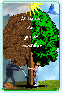
 Final: For my final poster I used the saying "listen to your mother." I made the side with the boy hugging the tree bright and happy because mother nature is happy that he's not trying to cut down any trees. On the side that the mans cutting down the tree I made the tree look dead, the sky dark and the sun sad, clearly his mother is not happy with what he's doing. I made the border so it looks more like a poster then a picture but I didn't want it to be to busy since theres already a lot going on.
 I learned...
- how to make only half of apiculture darker or lighter
- how to add clouds to any desired area
- how to flip or mirror a picture
- how to make good use of the opacity
overall I am happy with my finished poster. I think got my point across. and used a lot of techniques that were new to me.
social awareness

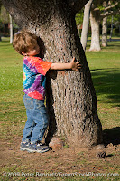
These are the two original pictures i used for the people in the poster.
Left: The only thing I had to do with this picture, once I deleted all the background, was flip him so he was on the other side of the tree
Right: Once I deleted all the background i realized the man didn't have feet, so I had to add shoes.
For the most part this was one o the eeriest parts of the poster
The pile of leaves are the leaves on the ground, but they also make up the dead half of the tree.

Right: This is the base of the background. form here I used a tutorial to make more clouds and either brighter or darker.
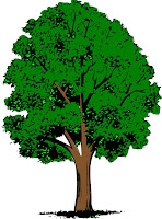
Left: I only used half of this three. I mirrored the right half and used that instead of using the original half. I liked that that side was more full and I thought it looked better if they were both like that.
 |
| This is the sun I used for both halves of the poster. I had to flip half the mouth so it was a frown not a smile and I rotated the eyes to they didn't look so happy. |
Monday, May 2, 2011
tutorial
 darkening parts of a picture
http://www.ehow.com/how_7388757_make-other-side-light-photoshop.html
I needed part of a picture darker then the rest. this is what i found to help me do just that. you are able to darken or brighten any specific part of a picture.
Adding clouds


before after
http://www.makeuseof.com/tag/easily-create-clouds-photoshop/
This tutorial explains how to make any thing look like a cloudy sky. it was really easy to fallow and I was also able to use the same steps when I wanted to make a dark storm like sky.
Subscribe to:
Comments (Atom)


