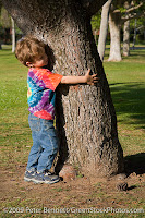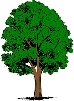
These are the two original pictures i used for the people in the poster.
Left: The only thing I had to do with this picture, once I deleted all the background, was flip him so he was on the other side of the tree
Right: Once I deleted all the background i realized the man didn't have feet, so I had to add shoes.
For the most part this was one o the eeriest parts of the poster
The pile of leaves are the leaves on the ground, but they also make up the dead half of the tree.

Right: This is the base of the background. form here I used a tutorial to make more clouds and either brighter or darker.
Left: I only used half of this three. I mirrored the right half and used that instead of using the original half. I liked that that side was more full and I thought it looked better if they were both like that.
 |
| This is the sun I used for both halves of the poster. I had to flip half the mouth so it was a frown not a smile and I rotated the eyes to they didn't look so happy. |


No comments:
Post a Comment